15. WrestleMania 25

Also worth mentioning is I don’t like stars on these sets. As in the shape, not like superstars. I think they are very difficult to incorporate into the rest of the set and WrestleMania 25 was a prime example of this.
The “25th Anniversary of WrestleMania” (Which was not the 25th Anniversary, that would be the next year) featured a stage that was comprised of one large star above a bunch of vertical screens. This was not a great stage on WWE’s part but it is the last one of this list that I would say I dislike.
14. WrestleMania XXVIII

This set summed up in two words would be “missed opportunity”. With a few alterations, I believe this could have been one of the greatest stages of all time. I would have preferred if the superstars emerged from below the screen as they did at WrestleMania 27, instead the stage was split in half to create an entranceway for the wrestlers.
This causes the sign to say WRESTL-EMANIA if viewed from anything other than a front view. The ‘Mania sign also blocks the view of the secondary screen, which often featured the wrestler’s names. It would have been better to focus on the names of the wrestlers and not the name of the show in this case.
13. WrestleMania 31

This set is virtually the same as the last one on this list. The issues listed above regarding the WrestleMania 28 set were fixed for this edition of the horizontal stage. However, this stage brought its own new problem. The font.
Most of these sets feature a similar font while this one goes for a more blocky, futuristic vibe. It is different but it doesn’t work for all the letters on the sign. The ‘R’ and the ‘S’ are almost unrecognizable due to the font choice. Despite this, the WrestleMania 31 stage is a highlight of a fantastic show.
12. WrestleMania 22

While there is nothing particularly wrong with the WrestleMania 22 stage, it also does not light the world on fire. Suffering from being confined to a small building, this set offers a fun aesthetic that matches the theme of the promotion for the show.
11. WrestleMania 21

This stage falls in the same category as the last entry. The WrestleMania Goes Hollywood theme was highlighted by this stage very well but the gimmicky nature of it holds it back from the top ten. Also a result of being in a small building, this stage was as good as it could have been given the circumstances.
6 years ago by Tempest
Trending
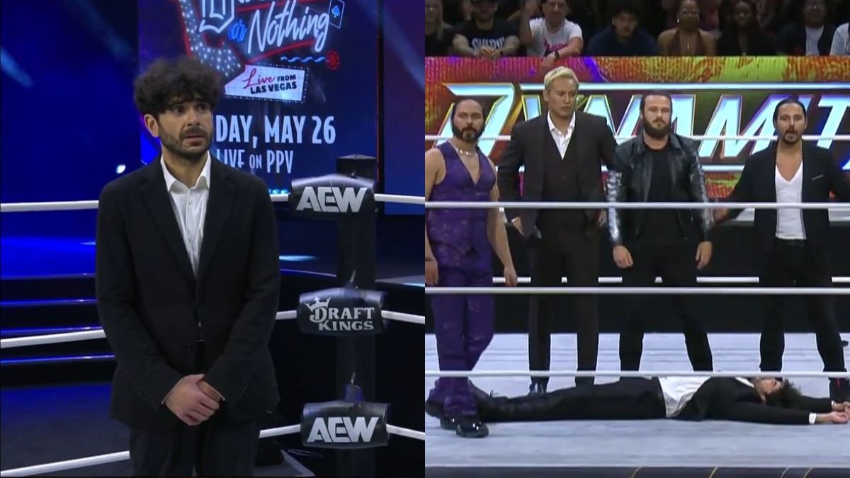
- Tony Khan Attacked By AEW Stars
- Top WWE Star Reverting To Old Entrance Theme?
- WWE Legend ‘In Talks Again’ With Company Following Vince McMahon’s Departure
- Tony Khan Backstage Update Following Jack Perry & Young Bucks AEW Attack
- Kenny Omega Breaks Silence On AEW Return
- Will Ospreay Championship Match Confirmed For AEW Double Or Nothing
- Jack Perry & Young Bucks Break Silence After Attacking Tony Khan
- NFL Reacts To Jack Perry & Young Bucks AEW Dynamite Attack On Tony Khan
- Former WWE Stars’ AEW Debut Announced
- WWE WrestleMania London Plans Addressed By Leading Politican